
Behind the Design: Emma Eubanks
Our new Night Claw softgoods collection was designed by Minneapolis designer and illustrator, Emma Eubanks. We asked Emma to tell us a little more about her artistic style, how living in the Twin Cities affects her art, and her inspiration behind the collection.
Hi Emma! Tell us a little bit about yourself.
Hi! I’m Emma Eubanks, a Digital Illustrator and Designer from Minneapolis. I was born and raised in St. Paul, and grew up on the bus routes connecting the two cities, where I gained a lifelong fascination with strangers and a love for the vibrancy of city life. After spending K-12 drawing on every homework assignment I ever received, I studied Illustration at the Minneapolis College of Art and Design. On day one of Art School I forgot everything I knew about proportions, perspective, and the color wheel, and I’ve been a lot happier ever since.
As a mixed Black woman of parents who were born before the Civil Rights Movement began, my creative practice revolves around paying respect to my history while embracing the future that my generation is a part of shaping. Combining my reverence for the people and cultures that raised me with my own 21st century worldview is a frequent guiding theme for my work and daily life.
Speaking of daily life- when I’m not scrolling through Wikipedia until my eyes burn, you can find me singing at the top of my lungs, throwing elbows on the dance floor, and insisting that Space Jam is the best movie of all time. Which it definitely, definitely is.
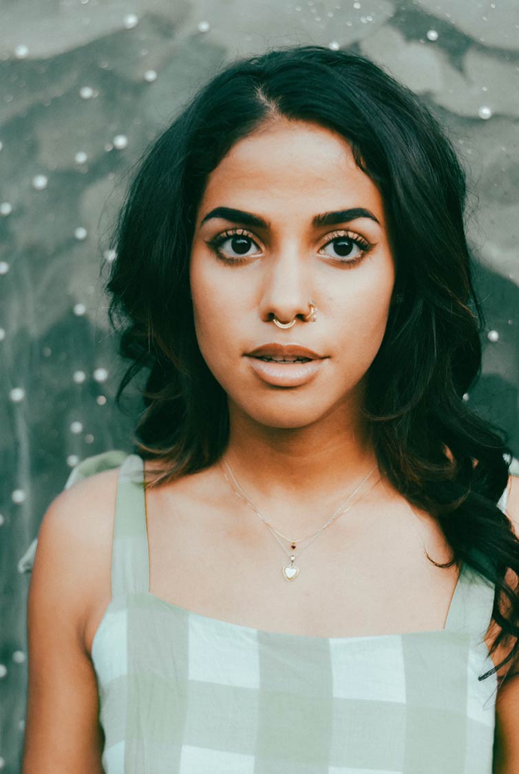
Photo credit: Nina Luna Photography
How do you think being from and living in the Twin Cities affects your art?
I’m from St. Paul (holler MIDWAY PERKINS if you feel me), but living and spending much of my life in Minneapolis has had such a profound effect on my art that I don’t think I could ever fully separate the two. As a kid, I devoured all forms of media and popular culture, much of which was either geared towards white culture or obsessed with it- not exactly an honest reflection of the spaces I often occupied. It wasn’t until I got older that I was able to recognize the profound impact that had on everything from my self-worth to my worldview. The more I grew and came to embrace myself fully, the more intentional I became with creating art that reflects the local communities that I actually see and am a part of.
In the past year and a half, being from Minneapolis has impacted me in many more profound ways. Between COVID-19, the murders George Floyd and Duante Wright and ensuing police and military occupations of Minneapolis, the population here has been barraged with overlapping trauma. Despite this, or because of it, I’ve seen the city come together like I’ve never seen before. We’ve rallied together to protest injustice, enacted community-based justice practices, and practiced sustained mutual aid. It’s also normal people becoming (and remaining) empowered to do this work, not only those in the activist community who have been doing said work for a long, long time. Seeing people who don’t consider themselves to be activists be activated is a really wonderful thing. Living here has also reinforced my faith in art as a tool for liberation. It’s been used for protest, to raise money for community aid, to provide hope, and to serve as an ever-present reminder of the things we’ve seen and done as a city. I’m very proud to be a part of the artist community at this specific moment in time, because seeing the way we put our labor where our mouth is brings me so much hope.
How would you describe your style / aesthetic?
I would describe my style as Saturday Morning cartoon with a little bit of stank on it. It’s pretty light and cartoony- not denying the grit of the real world, just givin’ er a cute little spin. I’m heavily inspired by the sheer technical capabilities of the digital age, and I lean into adjectives like garish (in a way that I’ve never been able to pull off with real paints or pigment) when I’m creating digital work. I still have a love that runs deep for mid-century design and aesthetics, so a lot of my work pays homage to traditional mediums like gouache and brilliant artists like Cliff Roberts or William H. Johnson. It’s important to me to have work that is simultaneously rooted in history while also embracing a design era that artists today are a part of shaping.
What is your favorite part of the creative process?
I have 2 favorite parts of the creative process! Total tie, love ‘em both. The first has got to be the anything-is-possible stage, which is right before I put pen to paper (or digital tablet, whatever). That’s the moment on the creative diving board where I can still take a dive in any direction. My second fave comes days, weeks, or even months later, when I’m fully in the zone and I’m speeding toward the finish line. A project rarely turns out how I’ve envisioned at the beginning, but that’s a moment when I can look back at all of the work I’ve just put in and appreciate the process taking me somewhere I wasn’t expecting to go.
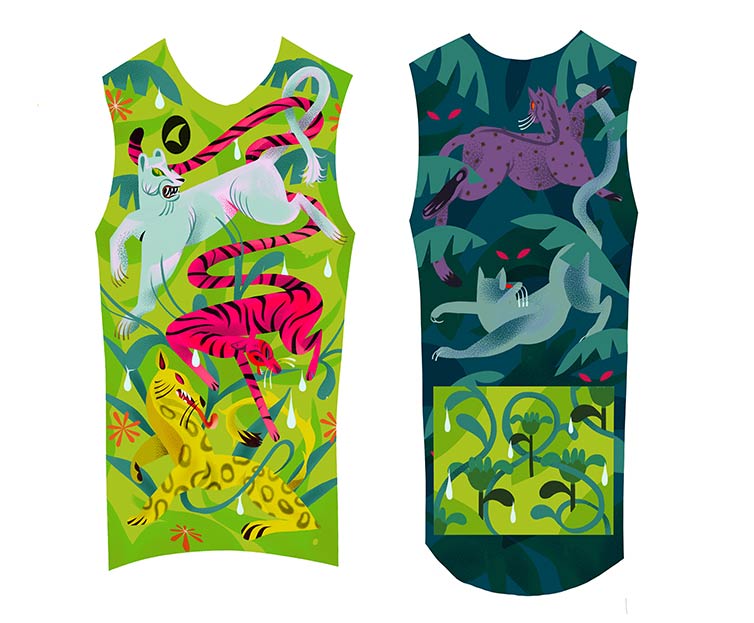
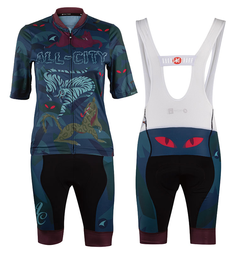
Can you describe your process for creating the Night Claw collection for us?
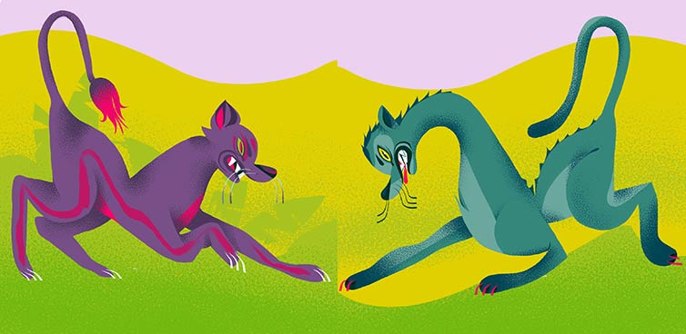
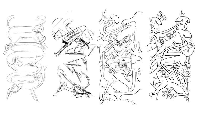
I wanted something that felt simultaneously wild and controlled- sharp angles next to soft curves, bold colors next to muted tones, and a calculated sophistication combined with carefree simplicity in style. After that, I bopped on over to Google images to pin down abstracting the anatomy of a cat, an animal it turns out I have literally never drawn before. To plan the composition, I used directional scribbles and diagonal lines to figure out the overall flow of the piece, then used them as a guide while I sketched the shapes to make sure that the piece still had its energy even after being refined.
I started off with a neon daylight color scheme with yellows, greens, and pinks. The nighttime color scheme idea for the back of the kit had muted greens, blues, and purples. This ended up taking over as the main palette, and main colors from the neon version (like hot pink) are used sparingly as highlights. I think starting off with the brighter colors helped inform the personality of the piece, but the art direction and guidance of Mike Jandora (All-City Art Director) really turned it into something special. It took a couple drafts to get the mood right, but working alongside the team to find the right vibe was really fun! This was such an exciting challenge for me, and I’m so grateful to have gotten to do it with my friends at All-City.
Follow Emma in Instagram: @emmastopdrawing

Leave a comment